Browse Frame Colors
A Frame Style for Every Piece of Art in Your Life
Profile color is one of the distinctive features we notice when looking at a frame, and the right one can complement the artwork perfectly. We've grouped our profiles into collections to make it easier for you to decide.


The Gallery Collection
Gallery style frames offer a stylish, minimalist look for people whose tastes lean more modern and simple.


When in Doubt, Black or White
Black and white are classic choices that don't appear everywhere just by chance. This duo is the most situationally-friendly when it comes to framing as they work well with most interiors, artworks, and photographs.
The Rustic Collection
Rustic style relies on warm, homey design elements that are a little rough around the edges, but in a uniquely charming and welcoming way.


The Classic Collection
With three styles to add a decadent pop of silver or gold to any room, a classic profile complements your artwork with a little bit of shine.


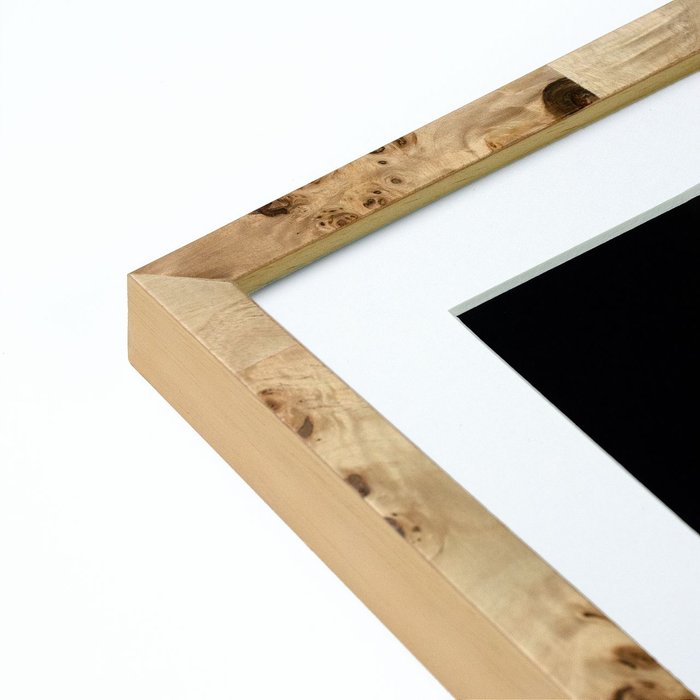
The Kota Collection
A range of rich furniture-finish stains on a refined fine wood grain makes Kota versatile for all types of art and interior styles.


The Modern Metals Collection
These sleek and modern frames with a polished finish complement a wide array of art and decor styles.


The Gold Collection
Three beautiful gold finishes for a decorative and timeless display
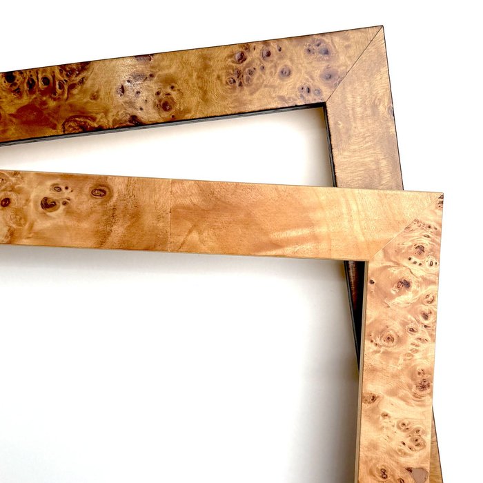
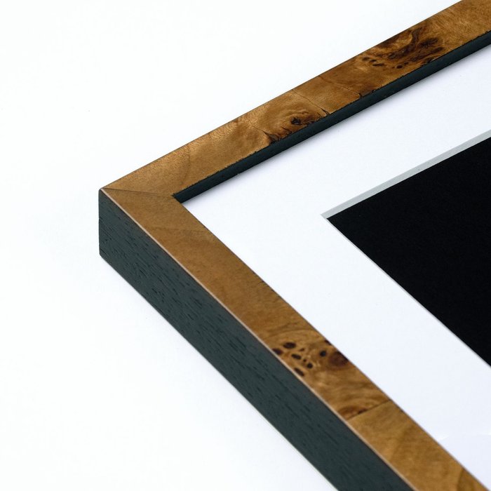
The Burlwood Collection
A warm and organic pair with hints of vintage character.
The Black Collection
Simple and elegant, black frames are always a good choice for most artwork.
Customize your frame in seconds with our unique frame editor. Give it a go below!
It's still not even close. @levelframes is still the absolute best / fastest / cheapest way to frame a thing. Seriously."
![]()
@AlexisOhanian
Still Can't Decide?
Continue with the rest of this guide to give you some additional guidance on what style and colors to go for.
We've compiled a quick list of things to consider when you're choosing a frame color to best suit the art you're looking to frame. To summarize:
1) What is the medium of art you're framing?
2) What is your focal point?
3) What is your current decor style?
1) What is the Medium of Art?
Medium refers to the different types of materials used in the art process. Any material can be used as a medium, here are the most common types you'll run into:
Posters, Prints, & Photographs
Because of their diversity in subject matter and affordability, posters and prints are a crowd favorite when it comes to purchasing wall art. Never let your poster go bare on a wall because you couldn't decide on which color frame to choose - aim for a color that's already used in the piece. Struggling to decide if you should add a mat? We provide some insight here: choosing the right frame and mat combos.
Black and white photos are generally accompanied by black and white frames. Frames for colored photos, much like prints, should ideally complement the dominant colors in the photo.
Paintings and Drawings
Traditional works such as charcoal, pastel, and watercolor go well with modest natural wood frames. Our natural gallery and rustic profiles show off the wood's grain beautifully which lends itself to a more unrefined, approachable feel.
2) What Are You Trying to Emphasize
Determining the focal point of an artwork is often a subjective task, so you as the art enthusiast should determine what you want the eyes to focus on. You can call out specific elements, tones and emotions by utilizing opposing subject and frame colors.
You can also manipulate the mood of your subject simply by changing the color of the frame.
3) What is your Interior and Decor Style?
The location and hanging placement of your artwork is just as meaningful as its accompanying frame. Decide where you would like your art to reside. If you're selling the work this may remain a mystery but if you're responsible for its final resting spot, you don't want it to look out of place.
If your gallery comes in the form of a residential home then it will come down to your current surroundings, style and personal taste. Modern, industrial, and contemporary homes pair well with white or black frames. In rustic, vintage, and bohemian dwellings, natural wood tones would look right at home. Don't be afraid to match your frame color with existing furniture you may have to create a cohesive space with various complementary features. Just reach out if you'd like us to match a specific shade from your room and we'll see track down any frames that'll fit. Or learn more about our Online framing service here.

Processing your Photo...